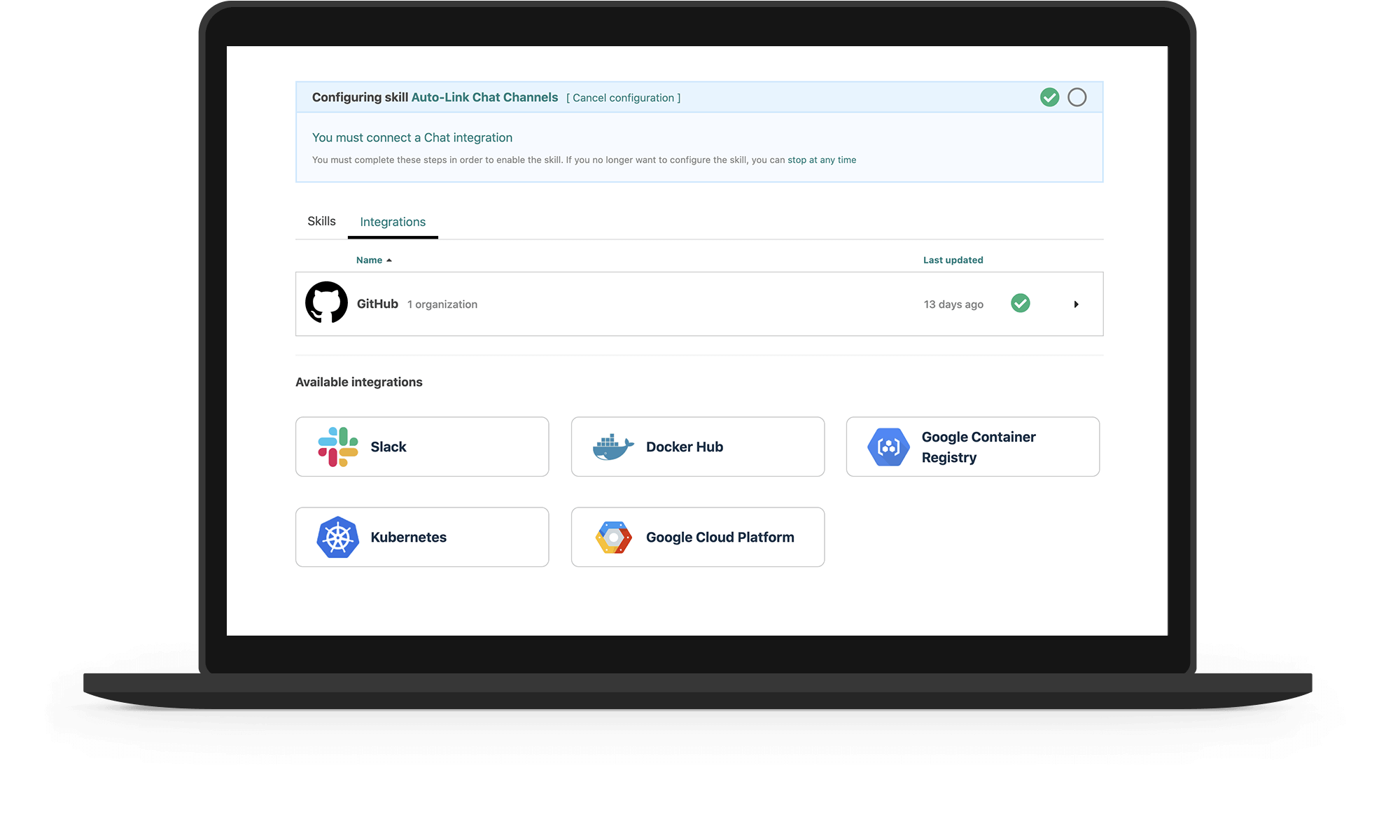
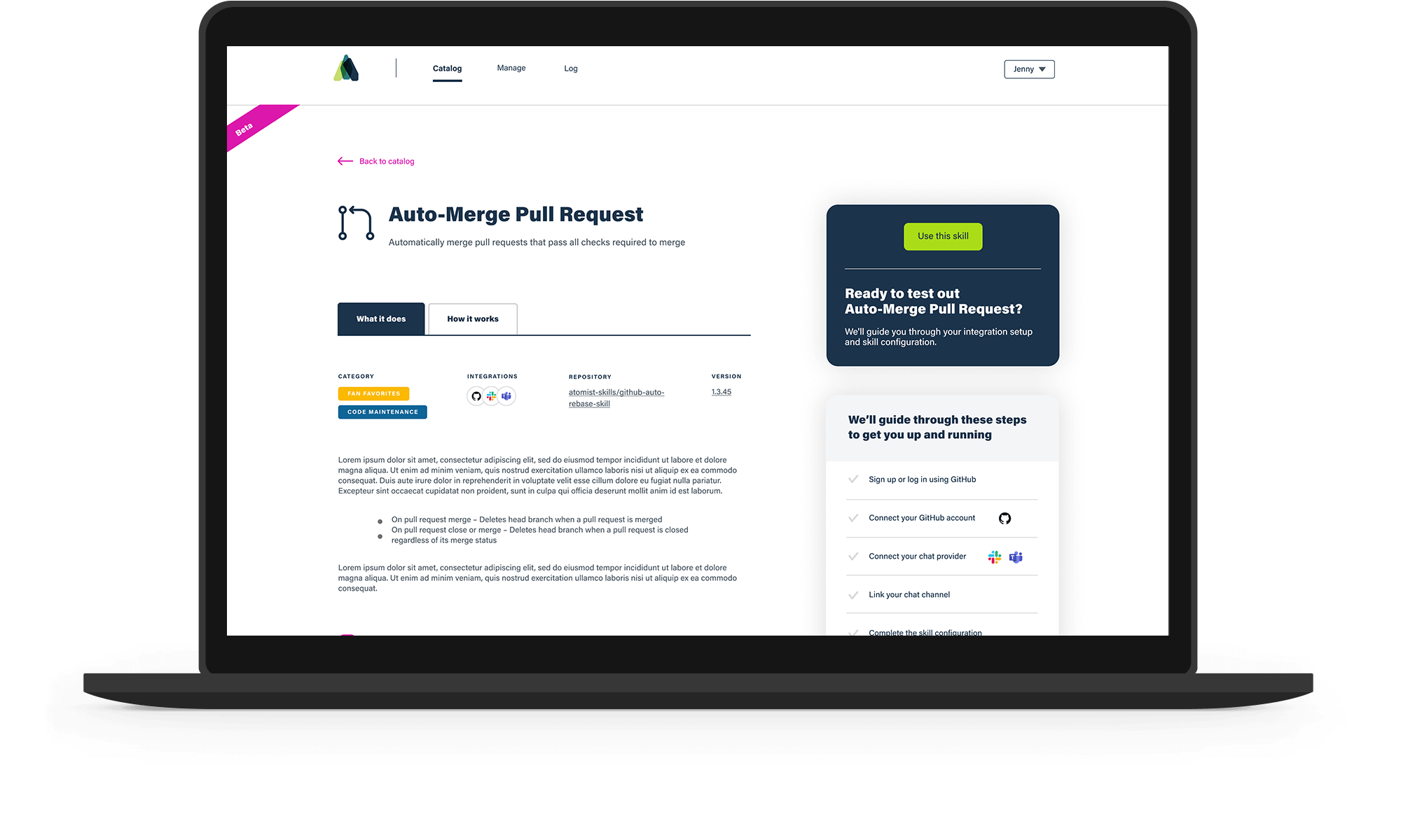
The web app UI is the golden nugget and what makes it so easy — it both guides the user through steps to turn on automations, and it allows users to fully customize their automations the way they want.
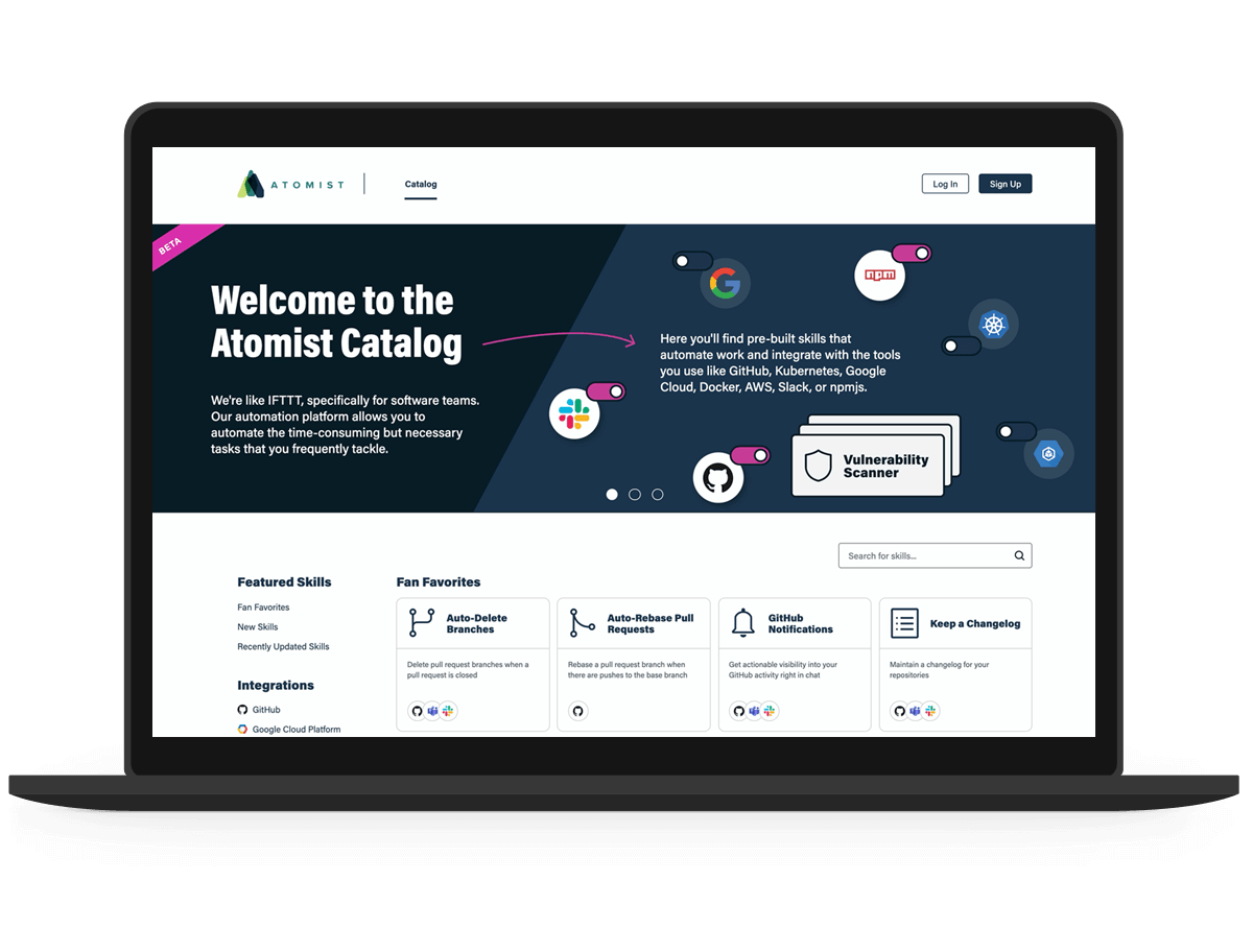
We hypothesized that we needed to minimize friction in the user flow of enabling an automation. I set out to conduct qualitative testing in order to validate our hypotheses and discover pain points.
Core KPIs to consider:
- Increase in number of new users
- Increase in skill enablement
- Increase in monthly active users — our north star metric
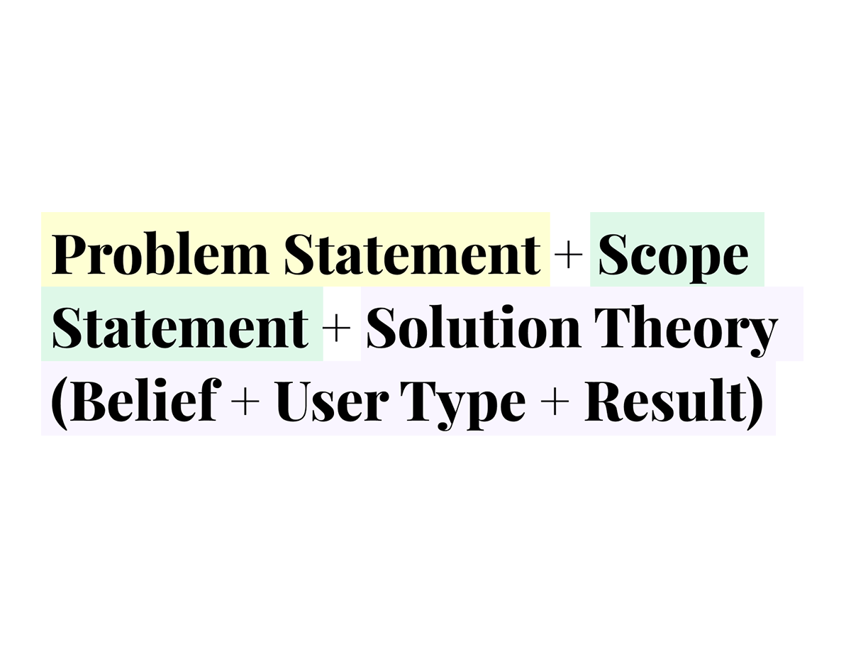
I used this formula to help us identify the user, the user problems we were trying to solve, and what the team believed would happen as a result of a solution.
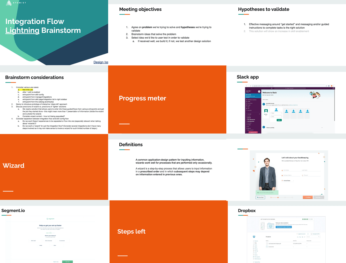
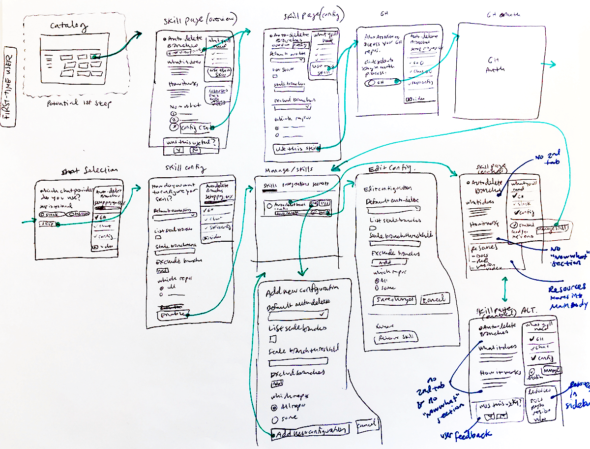
We considered various use cases and reviewed several concept ideas for guiding users through a step-by-step process.
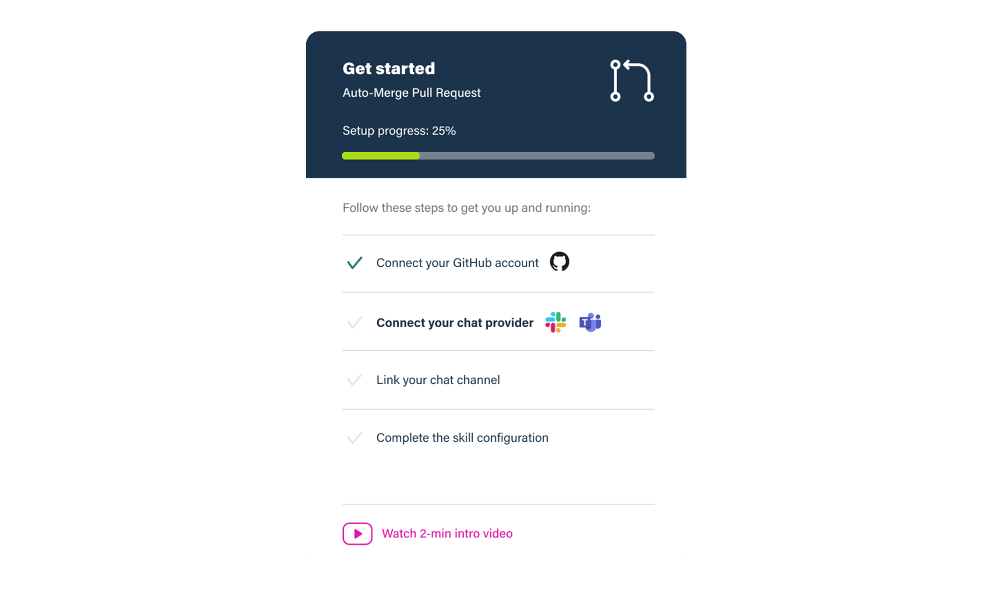
As a result of our brainstorm, we were able to narrow down a solution to pursue and test — a “light” wizard.
- Objectives for what we wanted to learn
- Testing method
- Testing script, including tasks and questions to cover
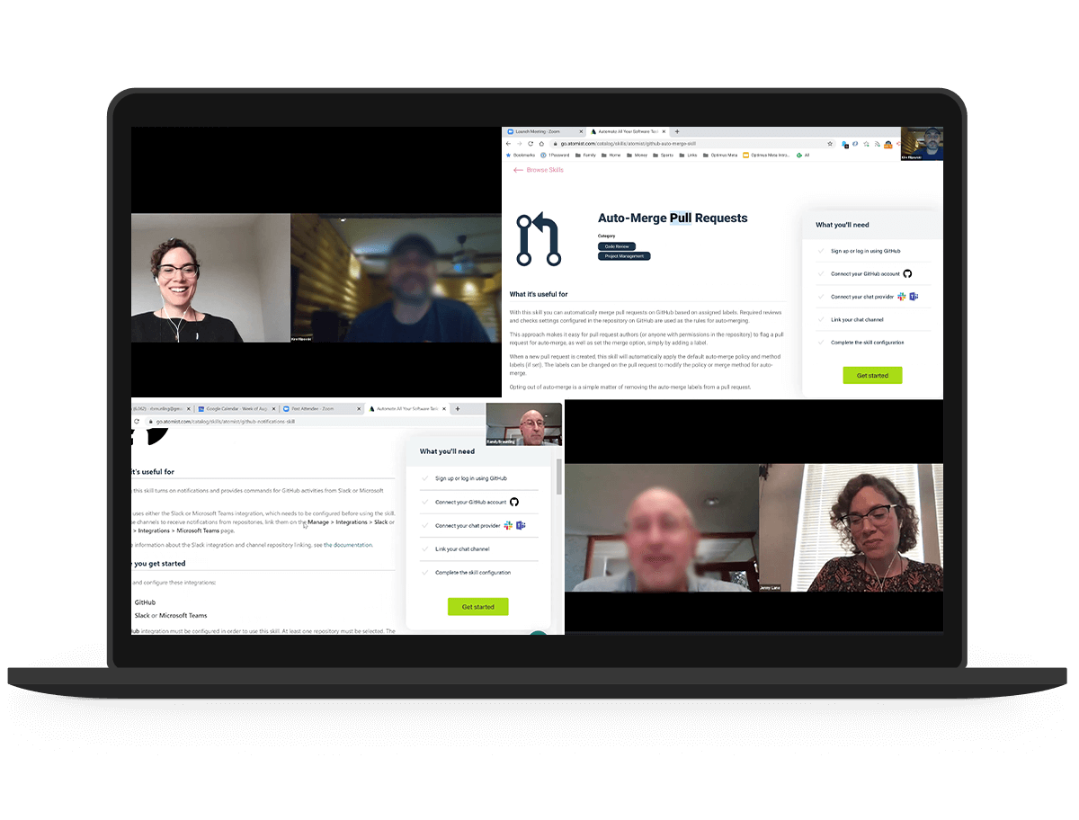
I also ran outreach to existing users which included manually sending personal emails to users who were signed up with Atomist, tracking responses, and scheduling interview sessions.
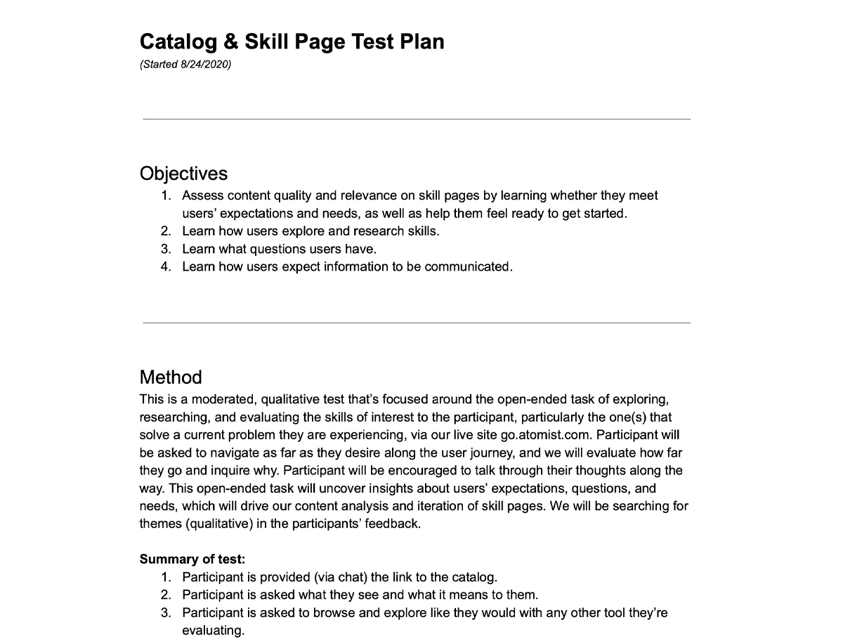
Our objectives included assessing content quality and relevance on automation detail pages, learning how users explore, learn what friction, pain points, and questions users have in the process and what information they expect to find along the way.
I conducted thematic analysis and synthesis of feedback and documented themes and key findings. I observed 6 primary themes, and 3 secondary themes, plus automation-specific feedback and feedback about our marketing website.
Surprising results:
- Users didn’t understand what a “skill” was and how they were different from integrations.
- Usability problems with wizard.
- Users wanted to know the value add compared to other tools almost immediately.
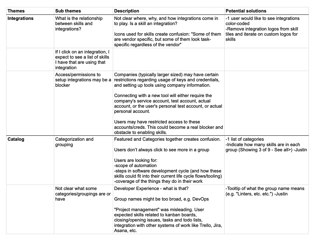
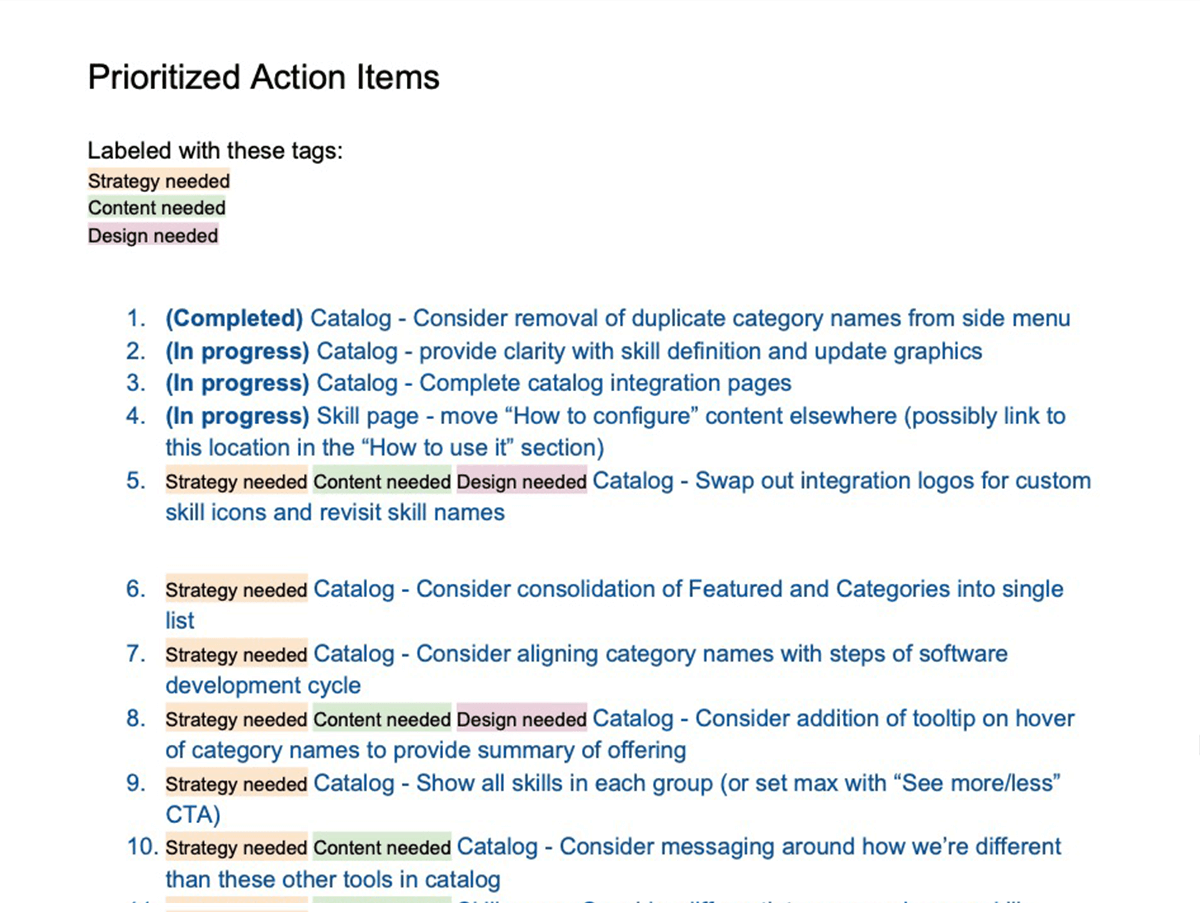
I then prioritized the action items, weighing effort and impact, and identified whether they required strategy, content, or design decisions.
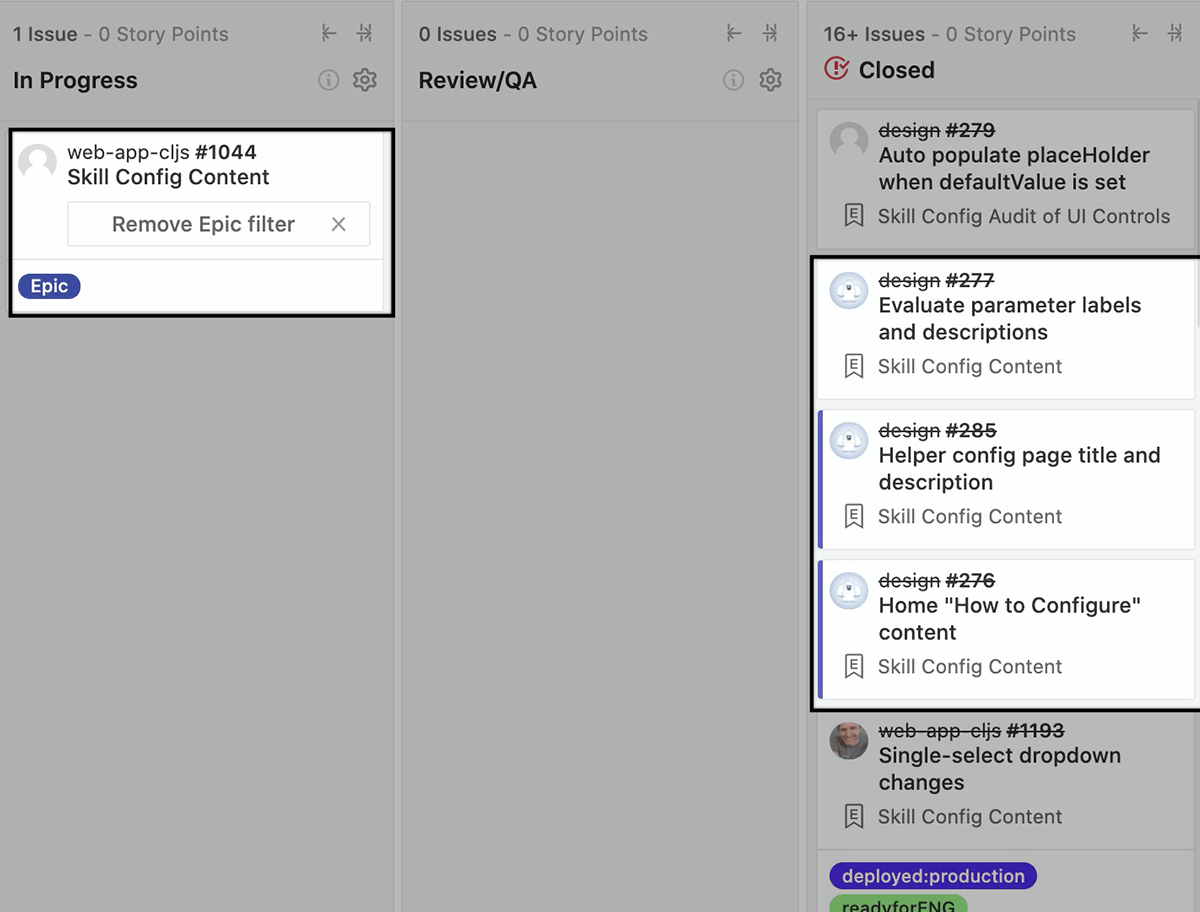
As we set more strategy and planning in place, we quickly saw a need for more structured meetings and communication, especially considering our distributed team across 4 countries. I started to join the daily engineering standup and we would hold frequent design reviews and walk-throughs.
Close collaboration with engineering was essential as well to get the updates implemented and to conduct proper design QA on all shipments.
- Our target users are difficult to reach so our feedback loops are rare and overly dense without enough targeted results.
- We waited too long to get feedback — we should have started sooner with lower fidelity prototypes.
- Scope creep increased time for delivery of epic work.