Texture
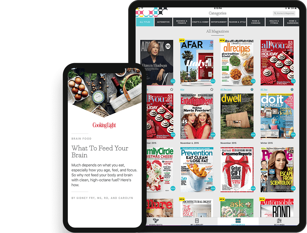
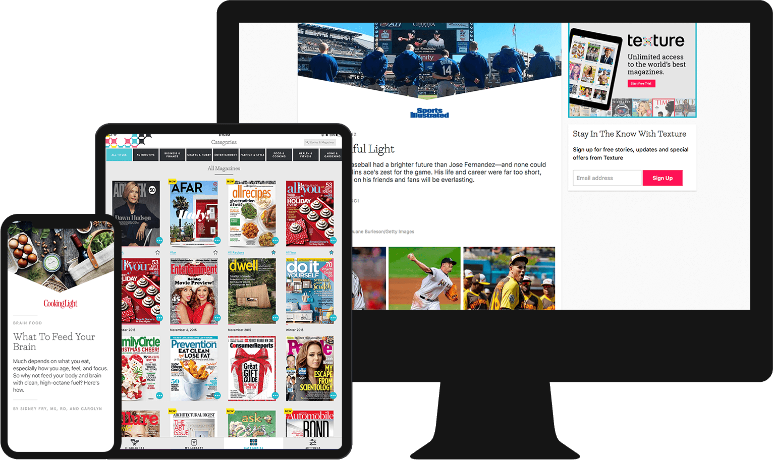
A digital magazine rack for iOS, Android, and web, giving users instant access to over 200 magazine titles.
2+
years
2015-2017
Top 10
iOS App Store
Acquired
by Apple
2018
Product
Texture brings magazine subscriptions into the digital age with its’ offering of over 200 magazine titles — providing users unmatched, high-quality reading experiences, even on mobile. This is no small feat, and Texture was able to achieve it with the ability to run PDF’s of magazine articles through their system, generating mobile optimized templates, specifically designed for mobile consumption.
Contribution
I worked with the Texture team as a contractor through Grio for more than 2 years to improve their app design and overall user experience, tackling everything from small, fast-turnaround projects to large, complex design efforts. I was an integral part of designing their mobile optimized templates — the end product which led to acquisition.
Case study:
Optimize magazine reading experience on mobile.
Problem
Texture’s technology allowed them to run PDF’s of magazine articles through their system with an output of individual elements that could be stylized in any way. I collaborated with Texture’s cross-functional team to reimagine the complex editorial design of magazine articles into a streamlined, consistent template of these elements that was readable and digestible for users on any device.
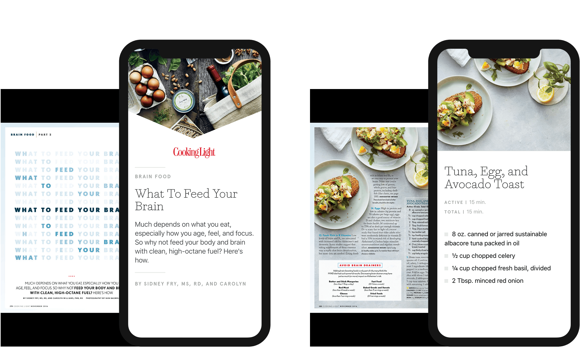
Translation of original magazine PDF to Texture’s mobile optimized template.
Discovery & Research
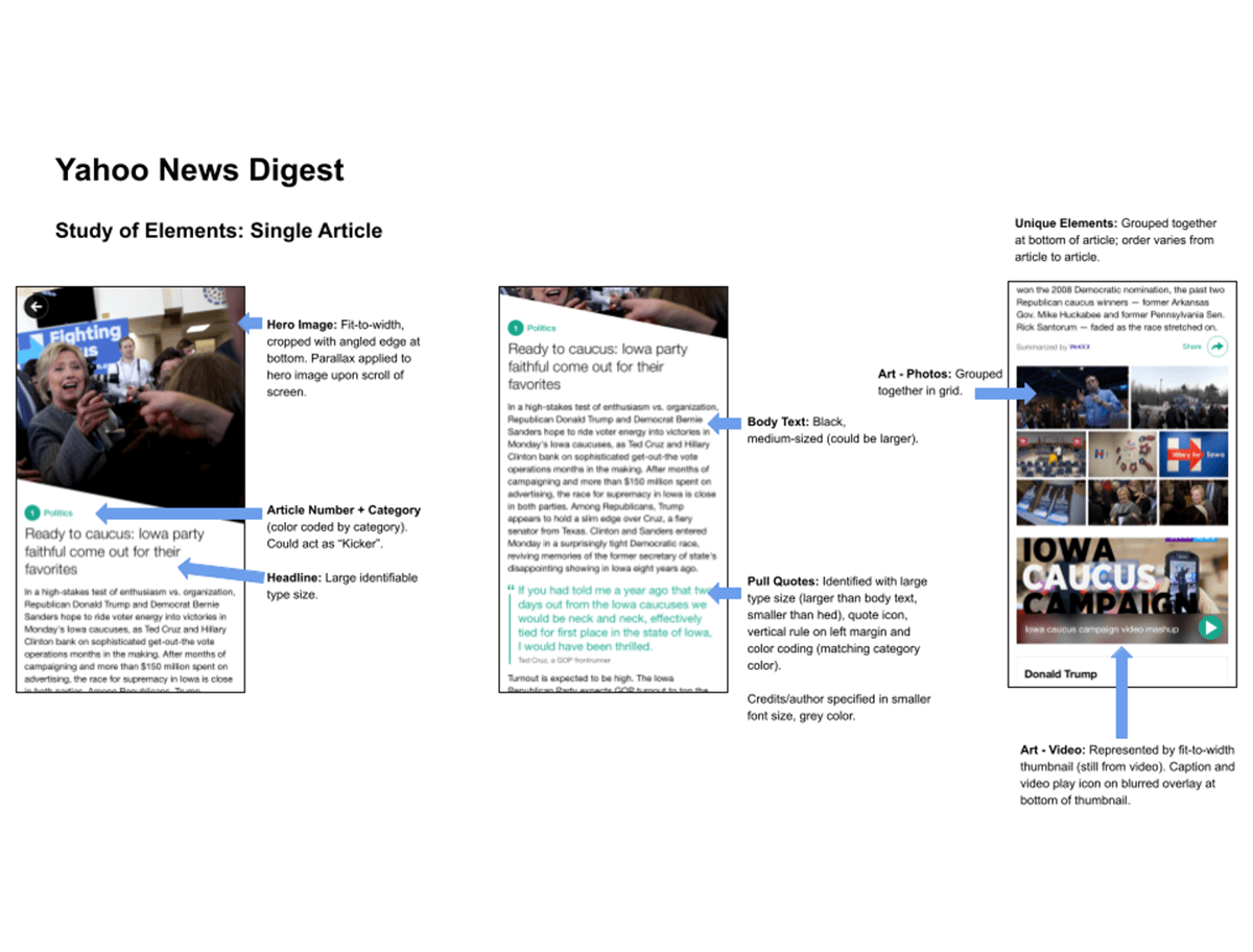
The process began with a dissection of editorial design elements of magazine articles and a deep analysis of common layouts. This gave our team the foundation to conduct a competitive analysis of existing products in order to understand the current space of mobile optimized article viewing. We examined how articles are presented outside the magazine format, the individual article layout, and specific element design solutions.
Deep Analysis of Content
Our review of magazine articles across titles allowed us to identify patterns. We then dissected the elements that created these patterns, informing the design of each element in our template.
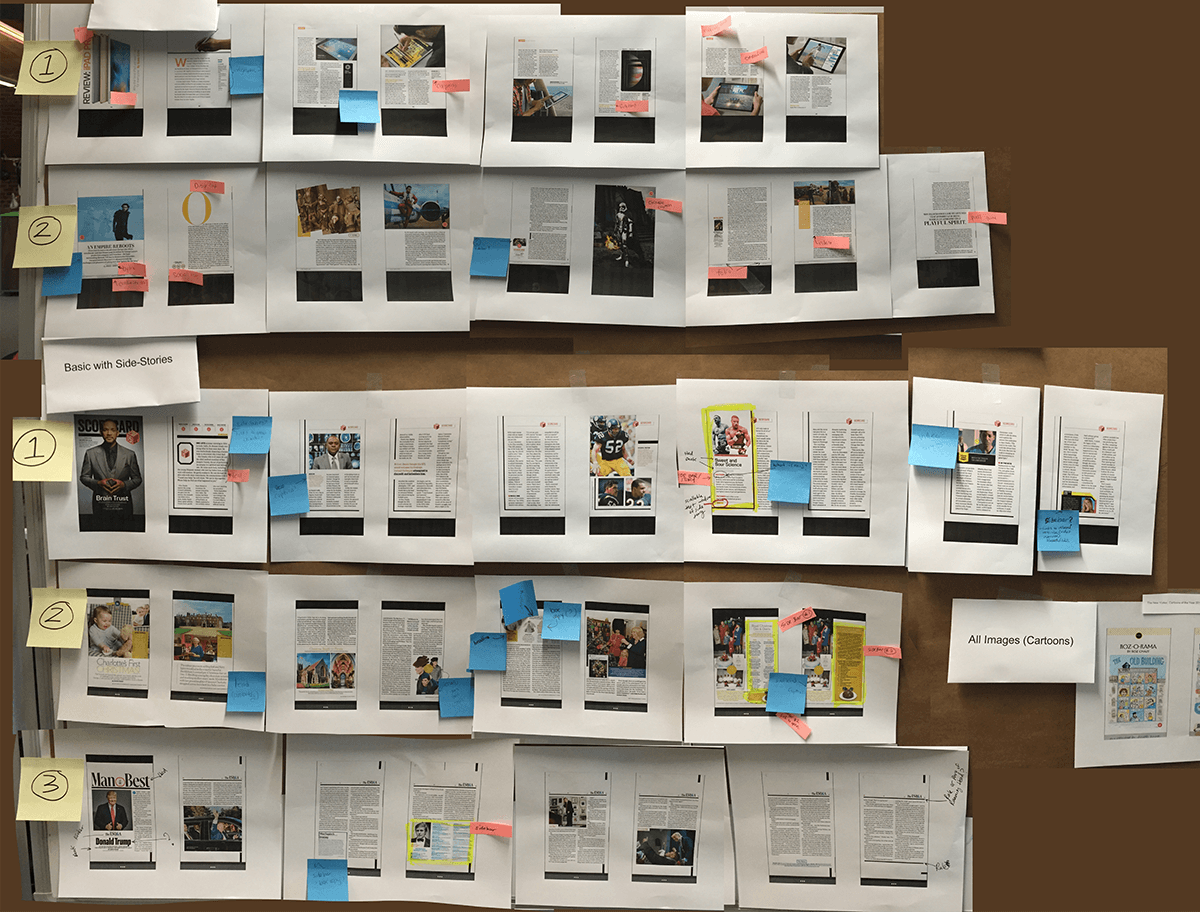
Documentation of Findings
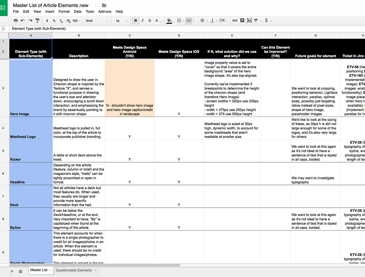
We scrupulously documented each element in our Discovery phase which allowed us to then have a high level view of the project and consider scalability.
Competitive Analysis
We reviewed ten competitor products to better understand the current space of mobile optimized article viewing and discover opportunities.
Collaboration, Documentation, & Style Guides
At the heart of a successful project is great communication. At various points through the process, it became clear that both verbal and written communication was imperative to get right.
Team Collaboration
This project was centered around cross-functional collaboration. First within design: I led and mentored a junior designer from Grio, and we worked alongside Texture’s design team.
Second between design and engineering: I worked closely with Texture’s engineer — one of the best design-engineer collaborations I’ve ever had.
Third between myself and the various teams at Texture including: product, marketing, content, engineering, and QA.

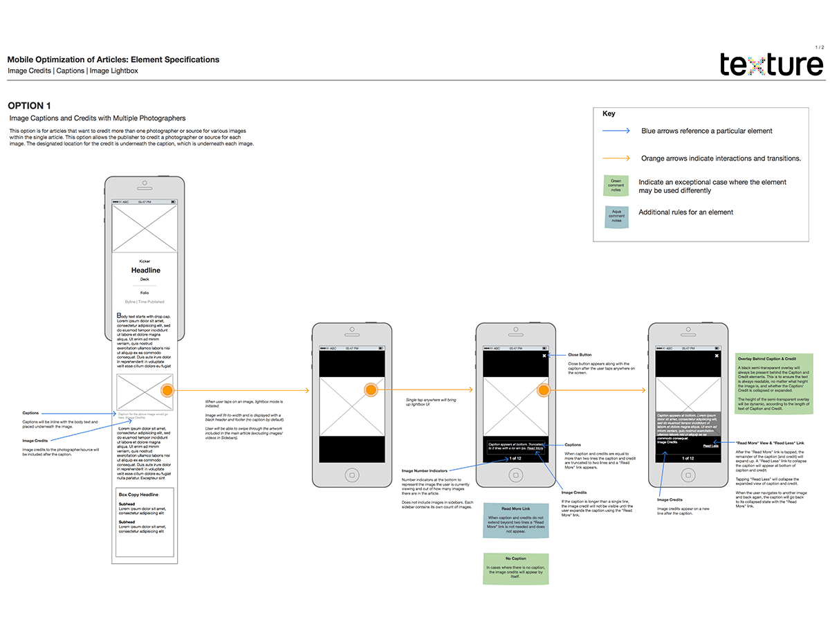
Technical Docs & Design Specs
This is part of written communication, and I believe it’s essential in creating team alignment.
I produced multiple design spec requirement docs to communicate to various teams within the company, including the content team and developers. It eliminates confusion and establishes a reference point for teams and stakeholders.
Style Guides
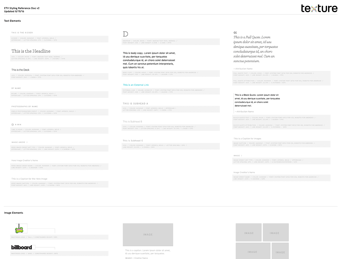
I collaborated with Texture’s engineer to produce a living style guide of our template of individual article elements and components. We used it to test implementation of each element and how they worked together in a single article.
In addition to the living style guide, I also produced static design reference docs used by other teams as a reference point.
Results
I am very proud of this project as it points to concrete successes in user engagement, and for the business at large.
Top
10
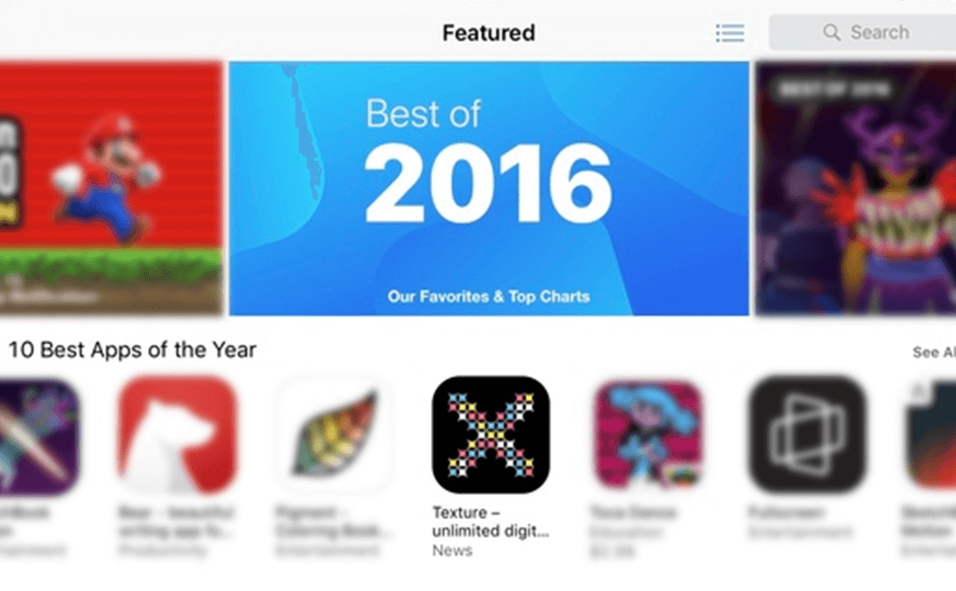
Rated top-10 best apps of the year for 2016 in iOS App Store.
30%
Increase
opens of mobile articles
&
time spent in articles
Cross- Platform
Design & experience for iOS, Android, & desktop.
Acquired
Apple acquired Texture in 2018. Read more here.
Client Testimonial
CLIENT
“Jenny was great to work with and an amazing asset for the team. She worked collaboratively with many stakeholders, including execs, engineering, and product, to create design and architecture solutions spanning research through production. Our project required a meticulous approach to nuanced design systems at scale, and she executed with both efficiency and a high attention to detail.”
James Gerlach
Director of Design at Little Passports
(was Director of Design at Texture)
(was Director of Design at Texture)