Rivals
A website and app centered around college football and basketball recruiting in the United States.
1+
year
2017-2018
2.8
Million
Users
Cross- Functional
Collaboration
Designs
Still In Place
Today
Product
Rivals, a very popular sports website and publishing network owned by Yahoo, is devoted to the recruitment of high school football and basketball players to college-level teams.
Contribution
I worked with Rivals as a contractor through Grio for more than 1 year to improve the overall user experience of engaging content centered around prospective players. I collaborated with our cross-functional team on a range of projects, small and large. A testament to my designs is they are still in place, years later.
Case study:
Profile redesign & data visualization.
Problem
We were conducting a visual redesign of user-facing pages, establishing a modern look and feel. A visual redesign, however, always exposes deeper problems and rarely stops at just a new style guide.

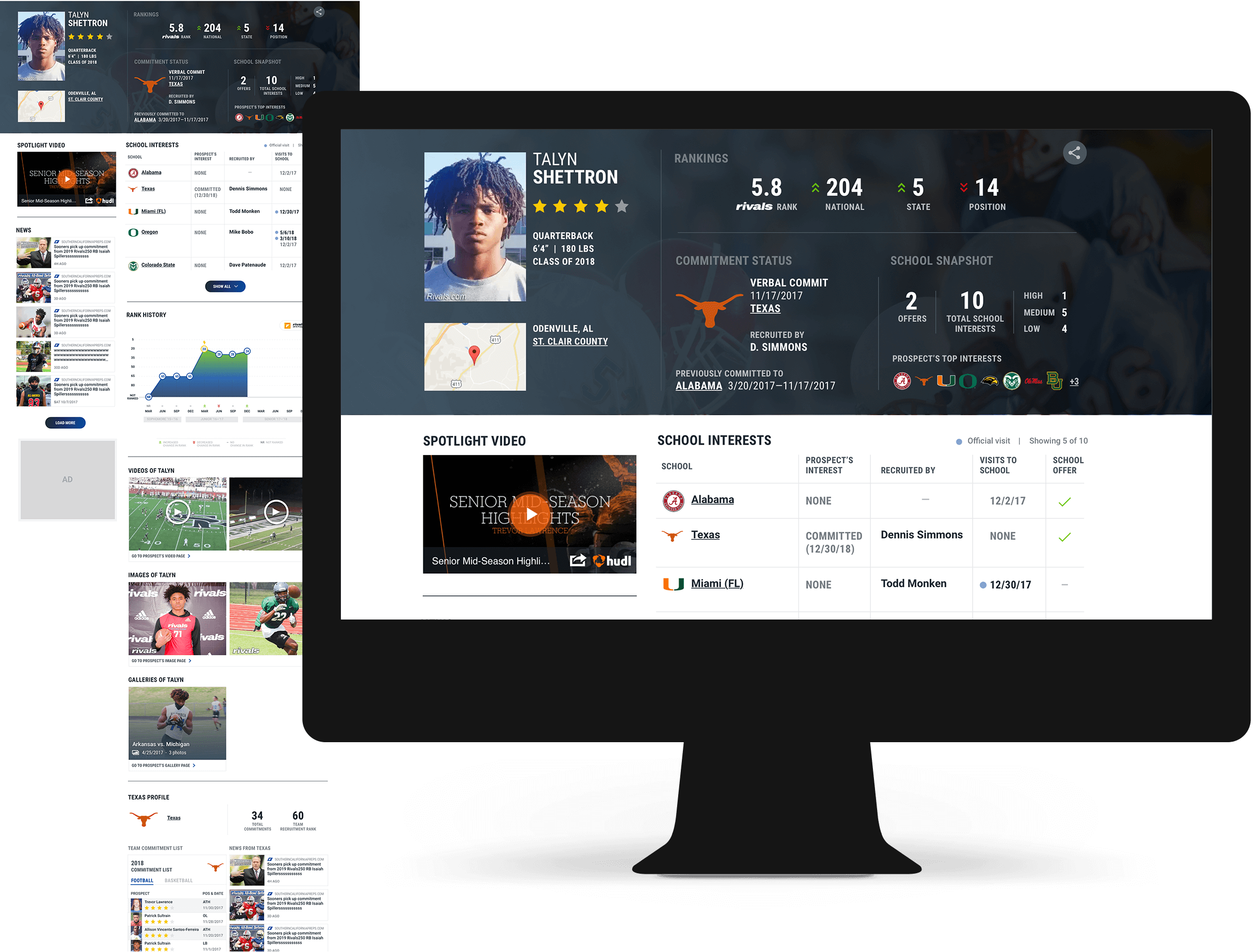
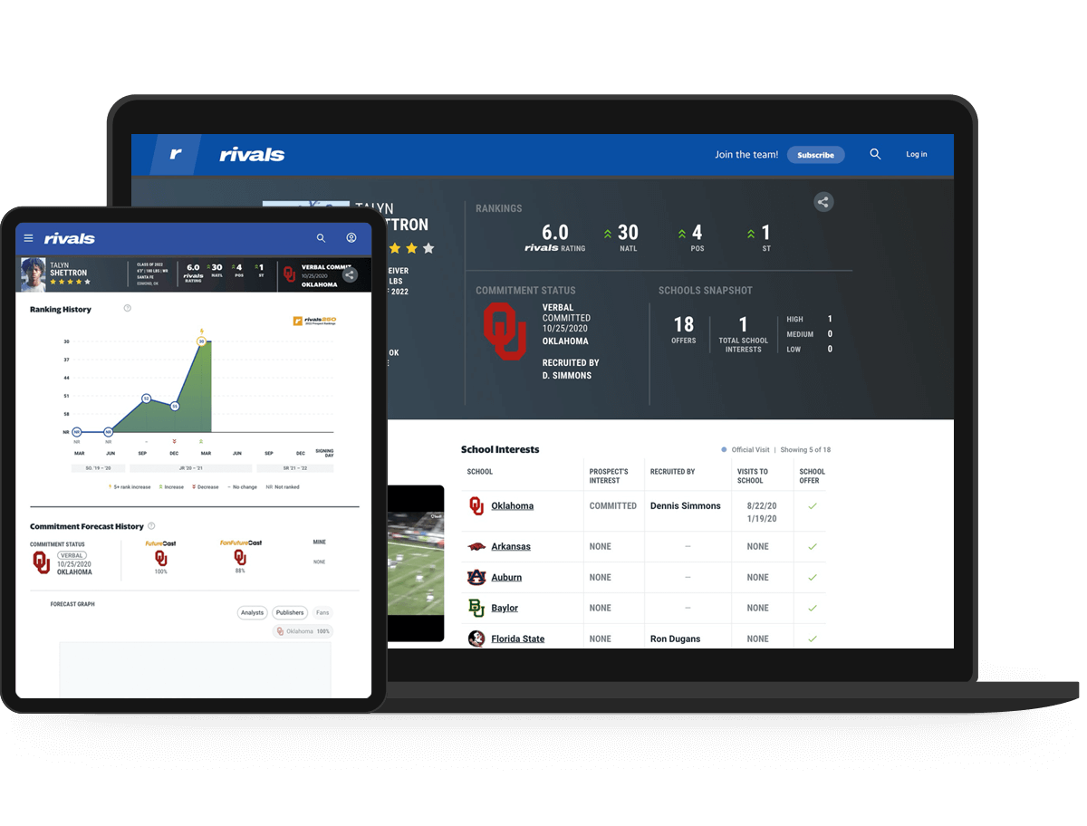
That was the case here with the player profile redesign: we weren’t just reskinning the product, we needed to dig deeper with a look at information architecture, content hierarchy, and creating more engaging, centralized content. All of this was driven by both business goals and user needs.

A top player’s profile before (left) my design work began, and today (right) as a result of the redesign.
User & Business Goals
There was a clear set of business goals to consider in the redesign of the player profile; however, the user needs were from a couple years prior. We hypothesized they were still relevant, but this led us to conduct benchmark testing to validate our hypothesis.
Business Goals
  • Increase paid subscriptions: create an attraction and lure for new traffic.
  • Increase re-engagement: we want it to be a useful during offseason, which a dormant period.
  • Facilitate discovery and search: make it easier to find what users are looking for but also discover new content.
  • Differentiation from competitor is important.
  • Dwell time is not important.
User Goals
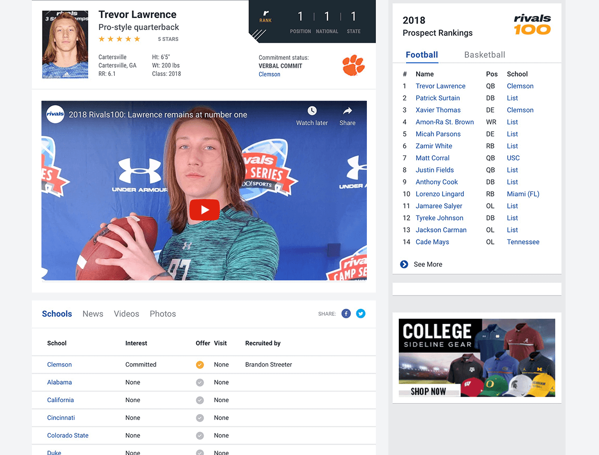
  • View media, including news, video, and images, of prospective players.
  • View school commitment history and interests of a player (as there are levels of commitment, players often commit verbally, de-commit, and commit to another school — this is interesting information for Rivals users).
Existing State & Benchmark User Testing
A partnering user researcher ran a benchmark test comparing the existing state of Rivals to a competitor site. We were able to utilize these results to iterate and improve our design.
Existing State: a Multi-Page Profile
The information architecture of the profile page was very disjointed in that all subsections were presented in tabs, requiring additional clicks.

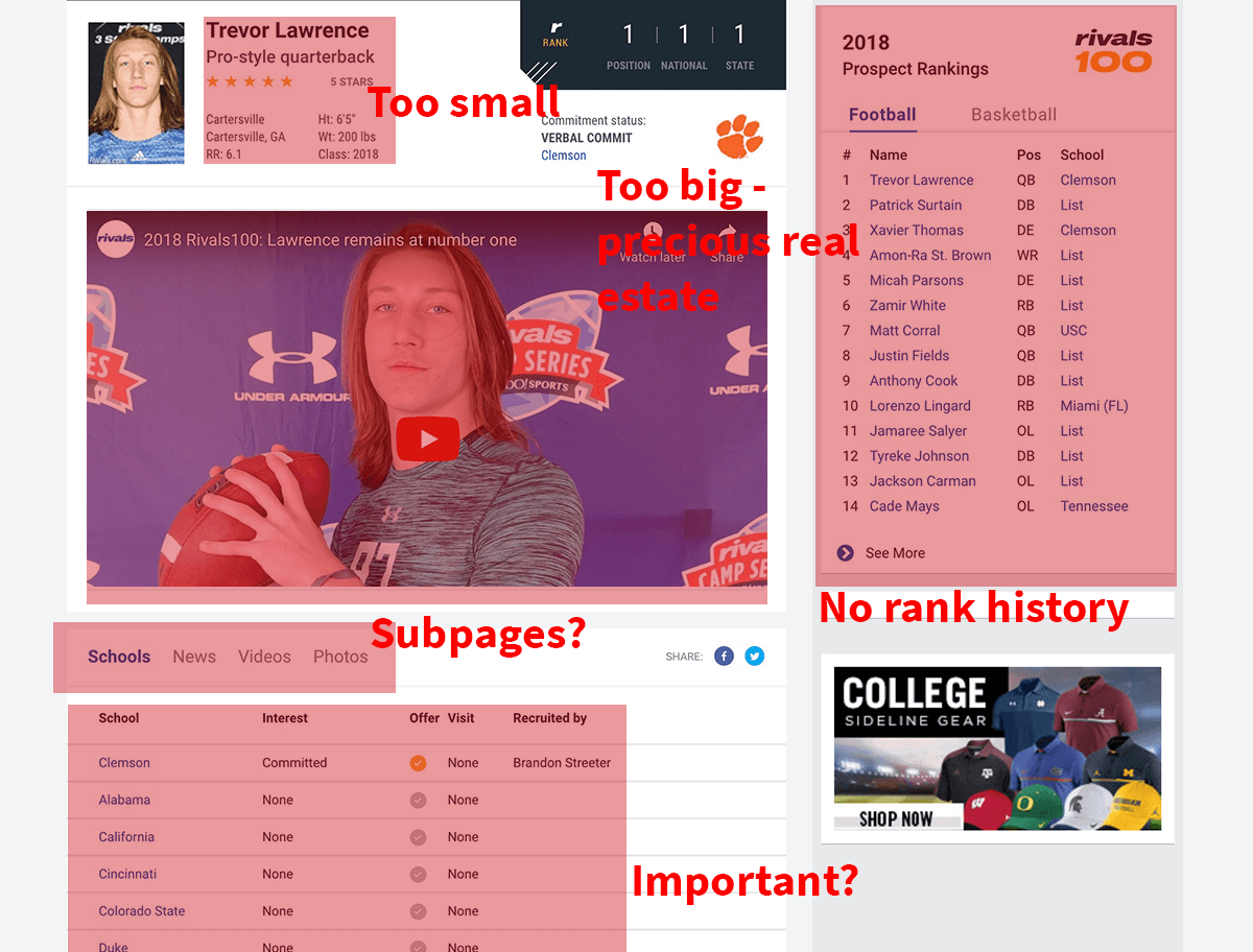
Some of the tabs unexpectedly linked users to subpages in order to access rich media content — a draw for Rivals’ users.

Testing Results
  • Consider ways to introduce more colorful, digestible, and fun content.
  • Make the profile page solely about that player — nothing else.
  • Consider auto-play for videos — they’ve had success on other sports websites in increasing engagement.
  • Do not redirect users to other pages for media content.
  • Commitment info is the most important content for users.
  • News, video, and stats on a player are also very important for users.
The 80/20 Problem
We encounterd a problem of data imbalance when trying to create a rich media profile for all players — it’s easy to do for the top 20% of players, but not so much for the remaining 80%.
4 Player Scenarios
The 4 player scenarios and their permutations present dramatically different densities of engaging content across all profile pages. For example:
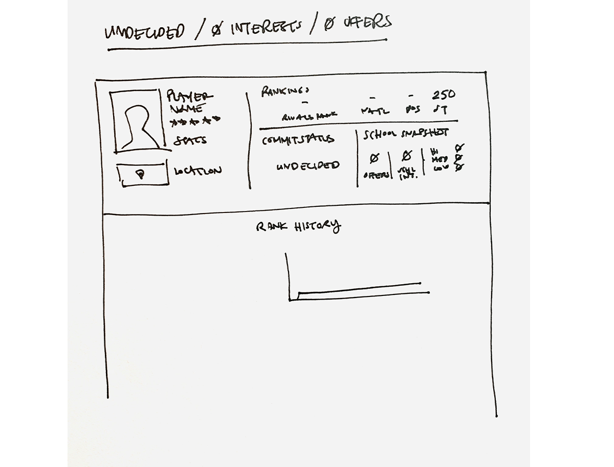
  1. Undecided / 0 interests / 0 offers → No data
  2. Undecided / 1 interests / 0 offers → Sparse data
  3. Undecided / 2 interests / 5 offers → Interesting data
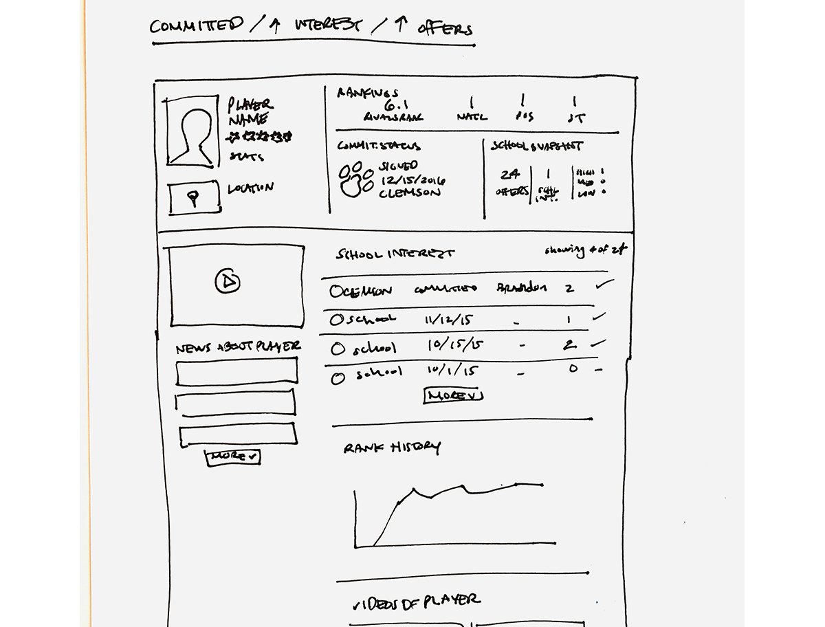
  4. Committed / 5 interests / 20 offers → Dense data
More Schools, More Data
The more schools a player has interest from, the more data on the page and the more engaging content there is. (Again, the same curse of the 80/20 problem.)
Deep Dive:
Rank History Graph
Problem
Rivals releases official rankings about 6 times a year. Constraints of the previous design meant they could only show 1 ranking at a time — the new one replaced the old, and the old became invisible.

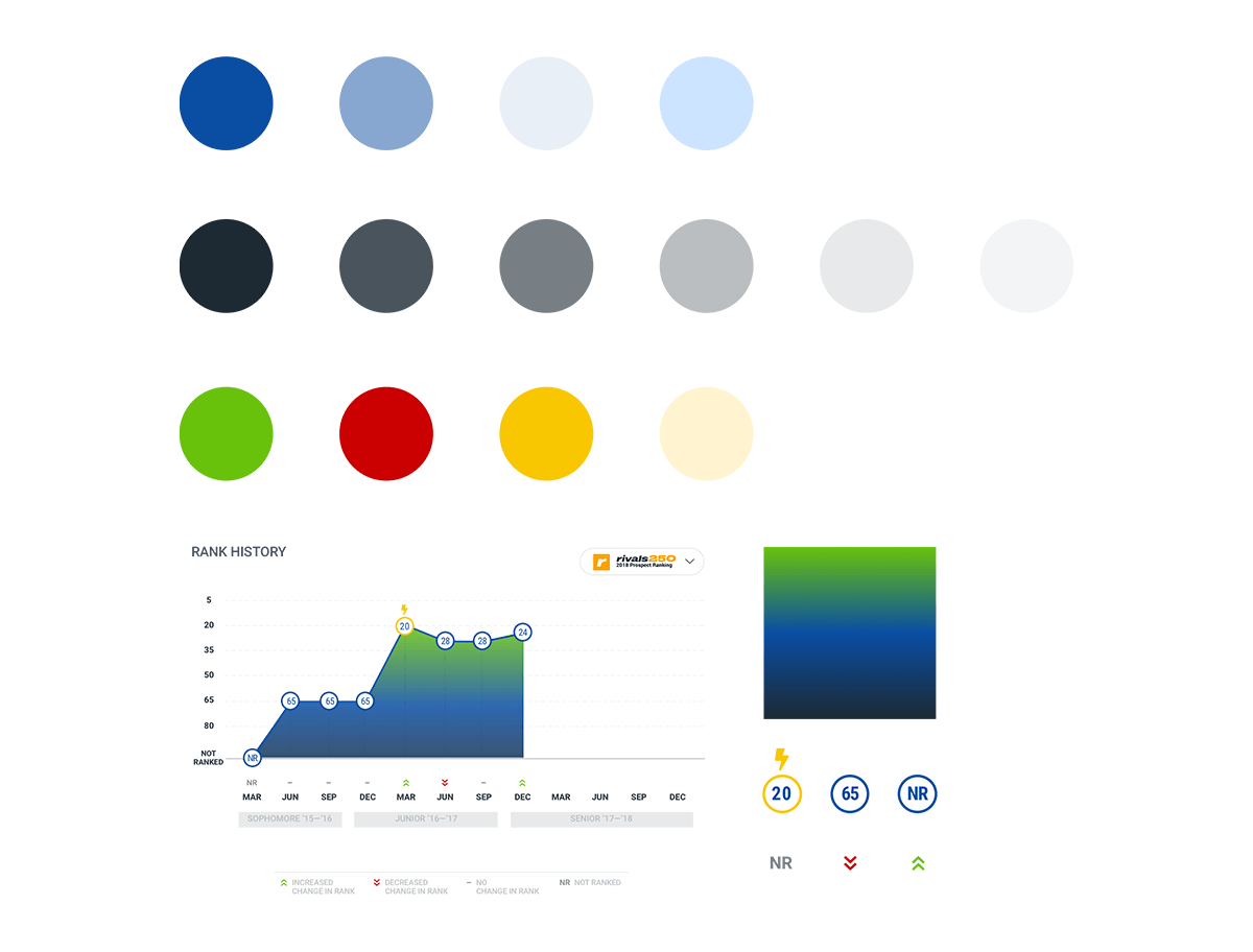
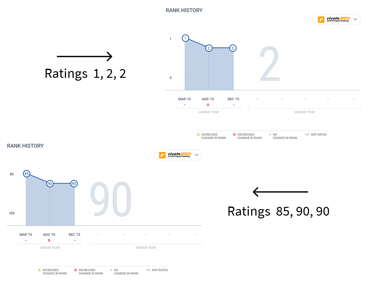
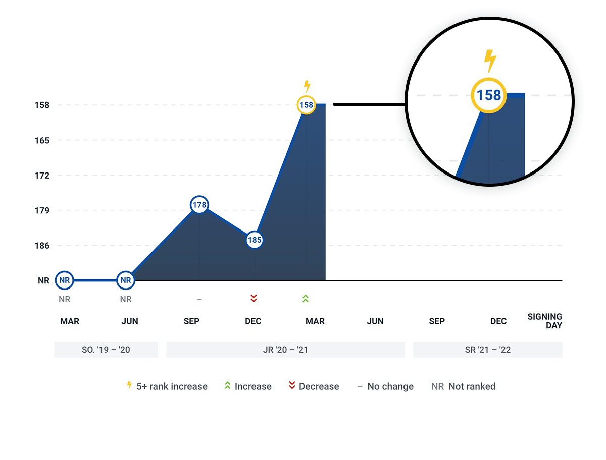
Huge business value was lost due to this limitation, so it became a top priority to implement a rank history graph for the profile redesign. The graph presented several design challenges in of itself.

Final design of player’s rank history graph.
Change in Scale & Edge Cases
Average change in ranking can be very large where the total number of possible rankings is 250. Due to this, we had to consider whether to change the scale of the graph per player, as well as look at all the edge cases and how that would affect the visualization.
Change in Ranking Can Range from Very Large to None
The first critical question we asked: is it more important to see the player’s individual ranking history, or to look at an individual as compared to others? We determined the profile page should focus on the individual, and separate rank pages should focus on comparisons to others.

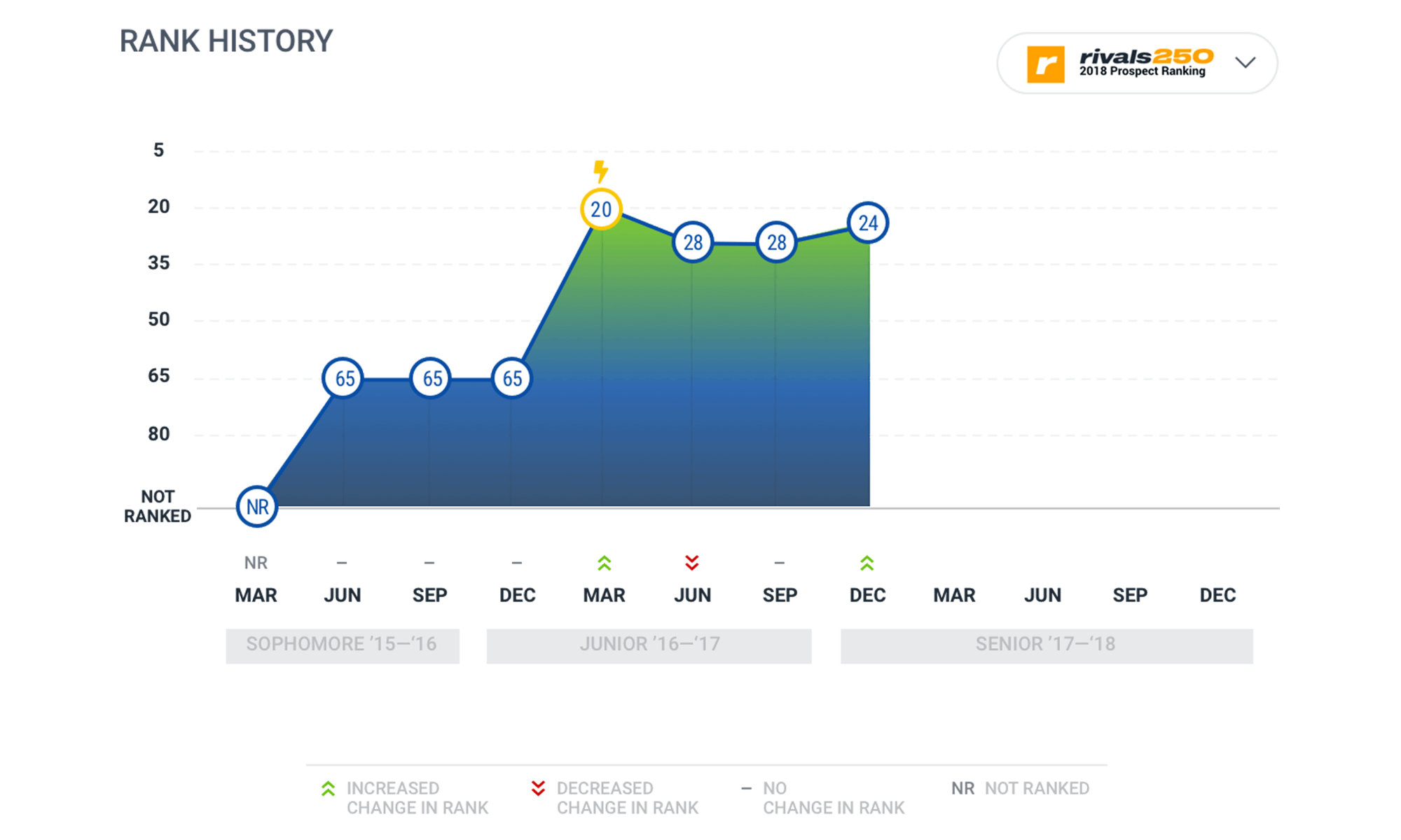
Given this, as well as other factors like the total number of ranks and possibility of dramatic change in rank, we decided to scale the graphs per player.

We referenced Google stock graphs for direction on standard practices.

X-Axis
We decided not to scale the x-axis, which showed time — more specifically, the entire high school career of a player (sophomore, junior, and senior), even if they weren’t ranked in all of their class years. This would create consistency and a common language across various profile pages.
Lots of Edge Cases
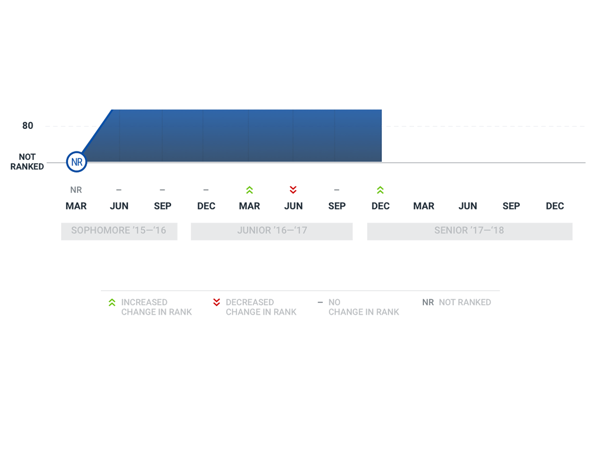
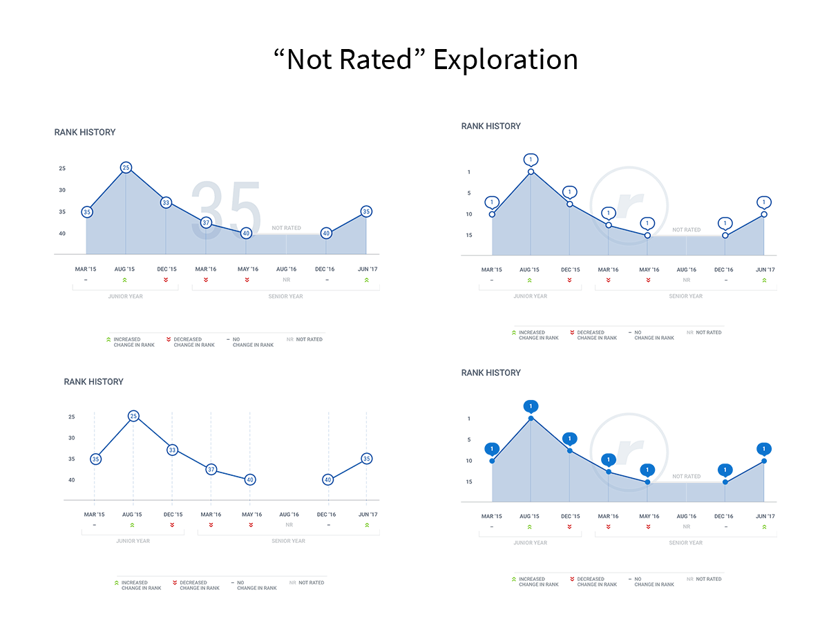
  • Players who are added mid-year.
  • Players who are dropped mid-year.
  • Players who are dropped and added back (there could be a gap).
  • Frequency of rankings per prospect is different for basketball vs. football.
Animacy Philosophy & Color
We needed to emphasize the increases and de-emphasize the decreases, so we carefully selected our color scale and symbols.
Represent Change — Not Good or Bad
Instead of representing good or bad, we wanted to represent change — did it go up or down?

We had to be careful assigning any metaphors other than “increased” or “decreased” or “stayed in same position.” We ran the risk of attributing a high rank with a negative one due to the fact the player hadn’t moved up in ranking.

It’s easier to make the mistake with metaphors like temperature, ribbons, or medals.

Reward the Good Only
There was an ethical consideration at play, given that the players we profiled on Rivals were 16-18 year old kids. Our team didn’t want to implement a design that could be detrimental to players’ emotions.

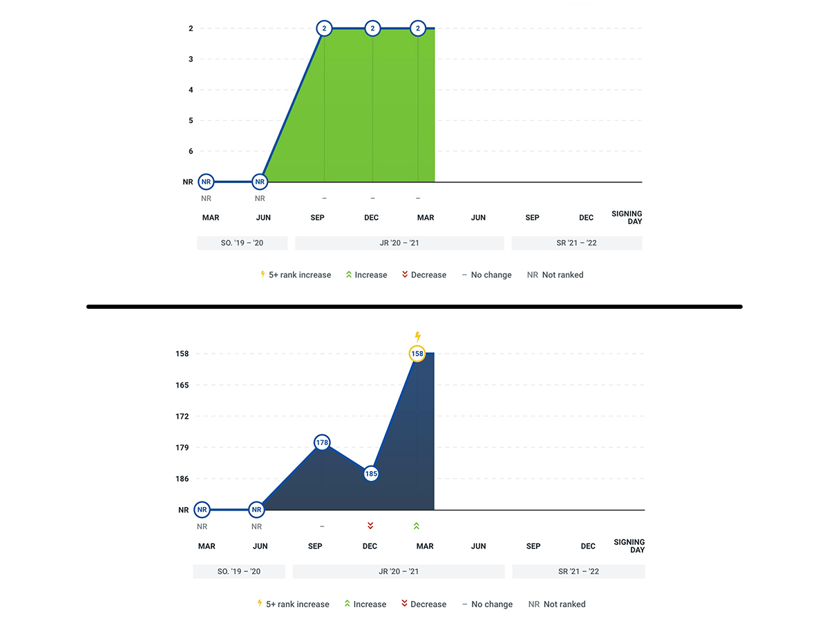
With that, to highlight a player that jumped up in ranks by 5+ positions (without highlighting a player that moved down), we displayed a lightning bolt symbol.

Considerations & Constraints
We considered object and agent metaphors in market commentary:
  • Object: describes price changes as movements of inanimate objects (e.g. the dow dropped off a cliff)
  • Agent: describes price trajectories as volitional actions (e.g. the dow fought its’ way upward)

Color:
We used a sequential color scale with a gradient from dark blue (bottom), to bright green (top). We were careful when choosing the interpolation for our data, due to our ethical constraints, as well as publishers’ sensitivities with usage of rival teams’ colors.

Results
Impactful player summary above the fold as hero, one page scrollable content with all media in subsections visible on the page. Rank history graph key visual component on page that connected to other elements throughout site, and communicated the right messages for rankings.
Final profile page design with engaging top summary and media content on a single page.
Client Testimonial
CLIENT
“As head of product for Yahoo Rivals, I relied heavily on Jenny’s exceptional and extensive UX and product skills, ideas, and design work to build toward the next generation of the brand and business. I felt her vision was cohesive and distinct, and kept usability and function as a core philosophy in the fairly complex, multi-device product that Rivals is. I’m grateful that the tone and direction she established with her work continues to influence our decisions and product identity to this day.”
Luke DeRossi
Head of Product at Yahoo! Rivals